On this page
- Mobile app · iOS and Android
- Health and fitness
- Interaction design
- Design system
- Accessibility
Urbanfit Studio: a coach, a dietitian and a tracker in one pocket
The mobile chapter of the Urbanfit case study. One design that sets up a personal plan, tracks the day, and connects people to paid experts, built for both app stores.

One chapter of a bigger system
Urbanfit ran several connected products. This chapter covers the member-facing mobile app, called Studio in the design file. The other products appear as their own chapters.
Wellness platform
The marketing and membership website, plus landing pages.
Studio mobile app
Plans, daily tracking, workouts, meals and expert consultations.
Store app and web store
Shopping for products, with its own mobile and desktop flows.
Control panel
The admin side for managing content, members and plans.
Four jobs, one bottom bar
The app had to do four jobs without feeling like four apps: set up a personal plan, track the day, train and eat to that plan, and put people in touch with real experts.
- Bet 1 · Ask little, give a planOnboarding collects only what a plan needs (goal, body, activity) and ends with a plan, not a blank dashboard.
- Bet 2 · Trackers should look alikeSteps, water, sleep and calories share one template, so learning one teaches them all.
- Bet 3 · Upsell in contextWithout a plan, the expert offer appears exactly where that expert would help, not in a separate store.
- 75Frames in the Studio mobile page: 68 screens and 7 bottom sheets
- 131Prototype interactions wired from one starting flow
- 4Tabs: Home, Nutrition, Profile, Fitness
- 4Home states, one per plan type
Four tabs on top of seven flows
The Figma page is organised into the same groups the app uses. The bottom bar holds four destinations, a count that fits both an iOS tab bar and an Android navigation bar.
Start
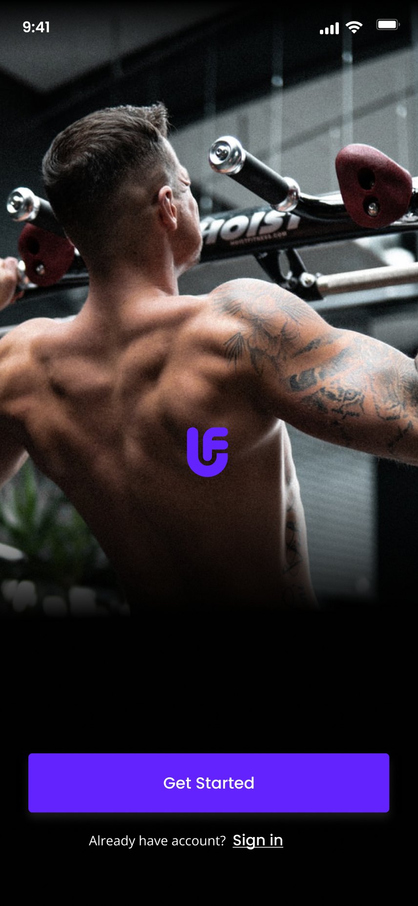
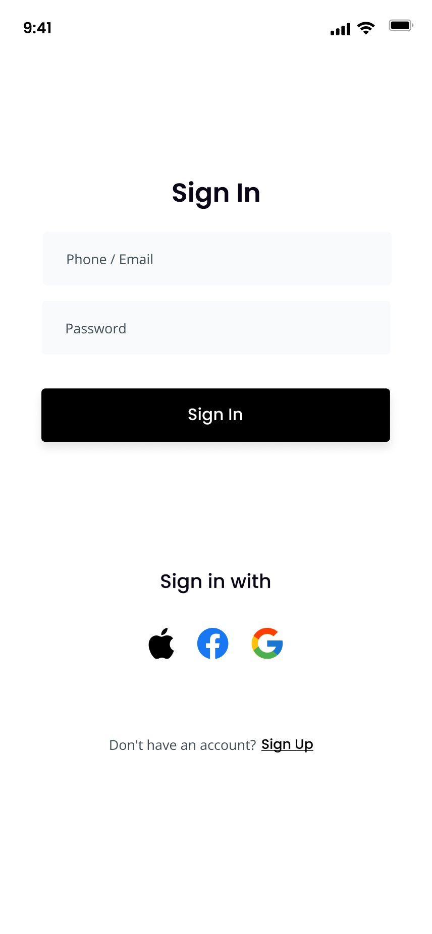
Splash, sign in, sign up, phone verification, then an 8-step plan setup.
Before the tabsHome
Greeting, tracker tiles, My Plan, activity graph, suggested workouts, blogs.
Tab: HomeTrackers
Steps, water, sleep, calories eaten and burnt, each with a goal sheet.
From Home tilesNutrition
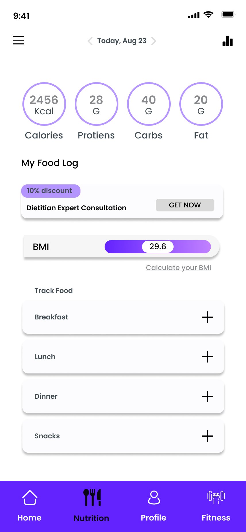
Food log by meal, macros, BMI, today's meals from a dietitian.
Tab: NutritionFitness
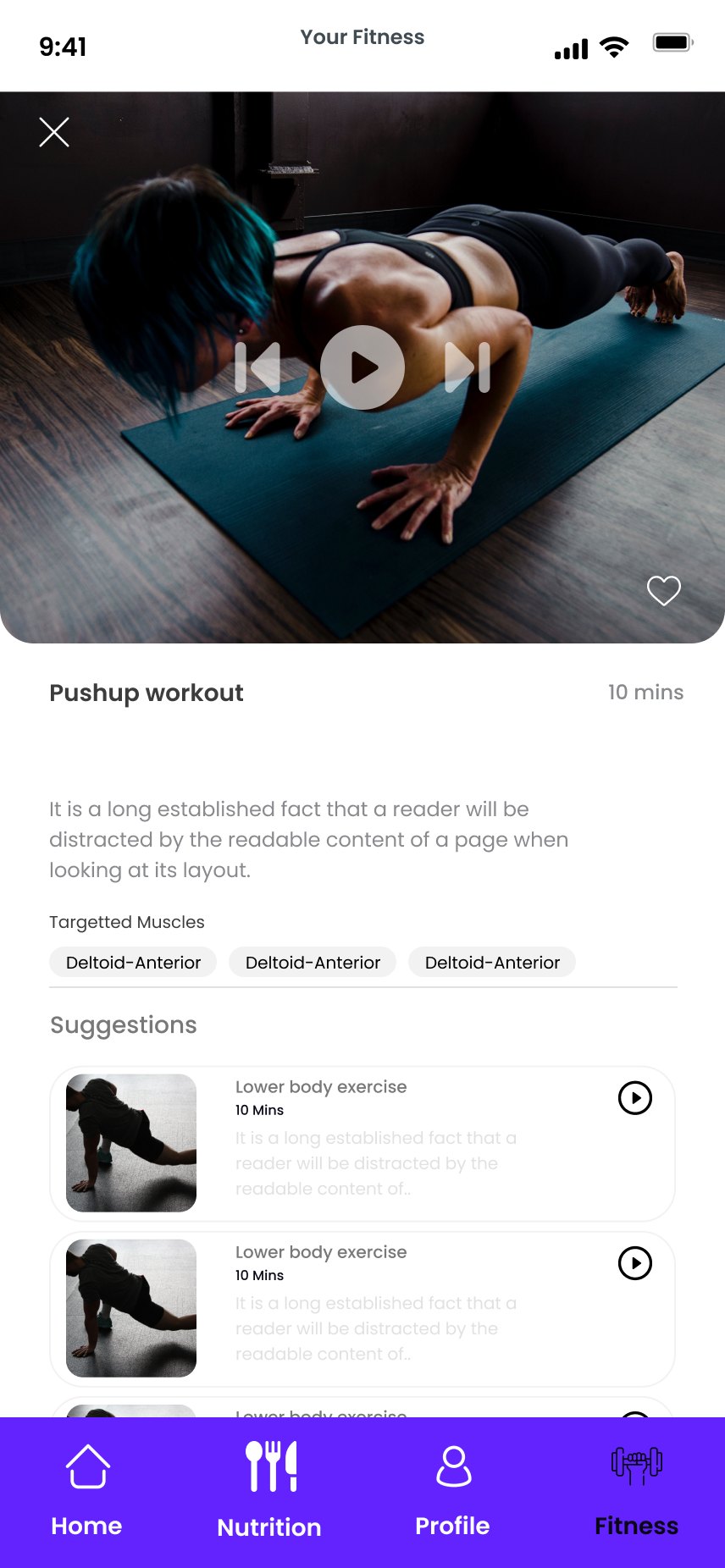
Workout library by body part, video player, workout tracker.
Tab: FitnessExperts
Pick a coach, book a slot, chat or call.
From plans and tabsProfile
Account, six reminder types, saved items, notifications, legal.
Tab: ProfilePlans and checkout
Plan list, durations, summary with promo codes, payment.
From upsells and ProfileEight short questions, then a plan
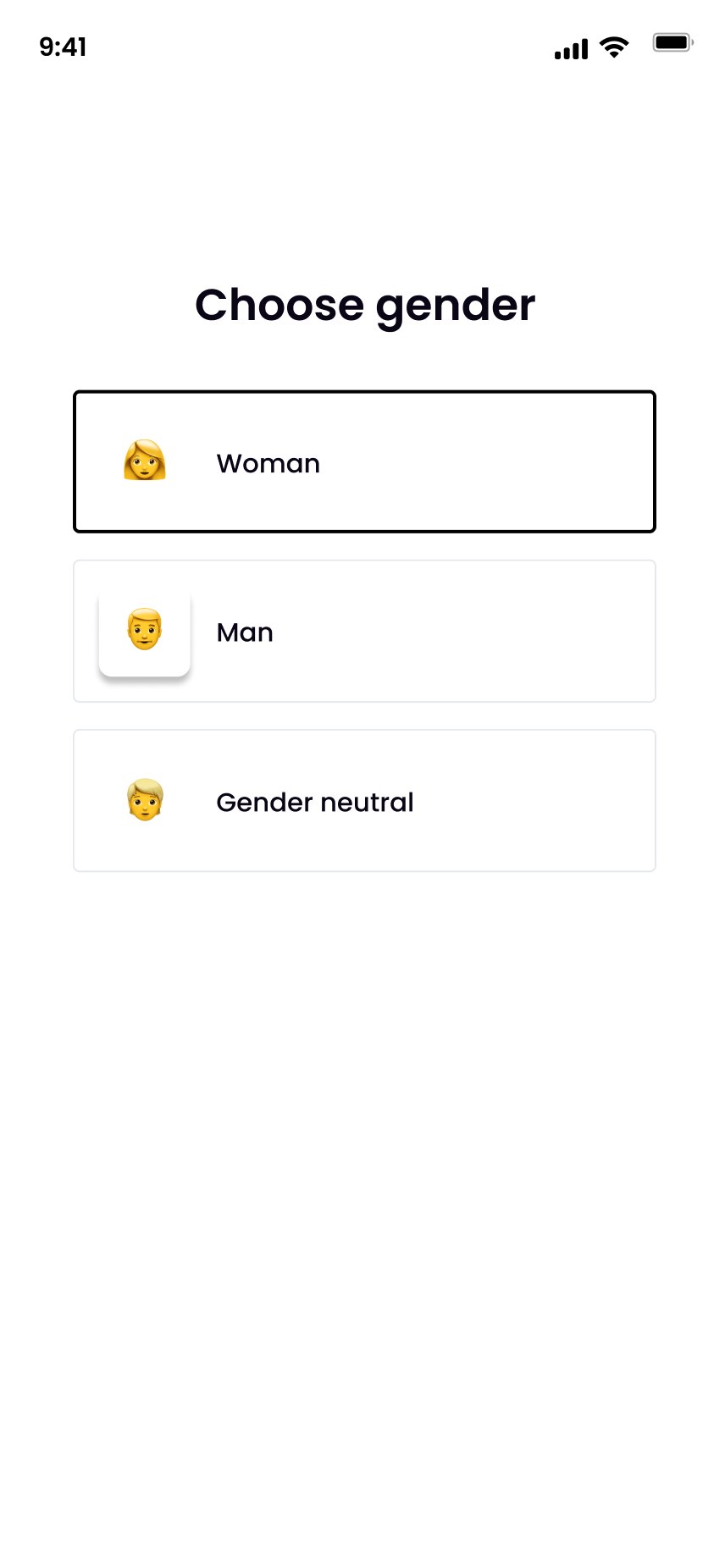
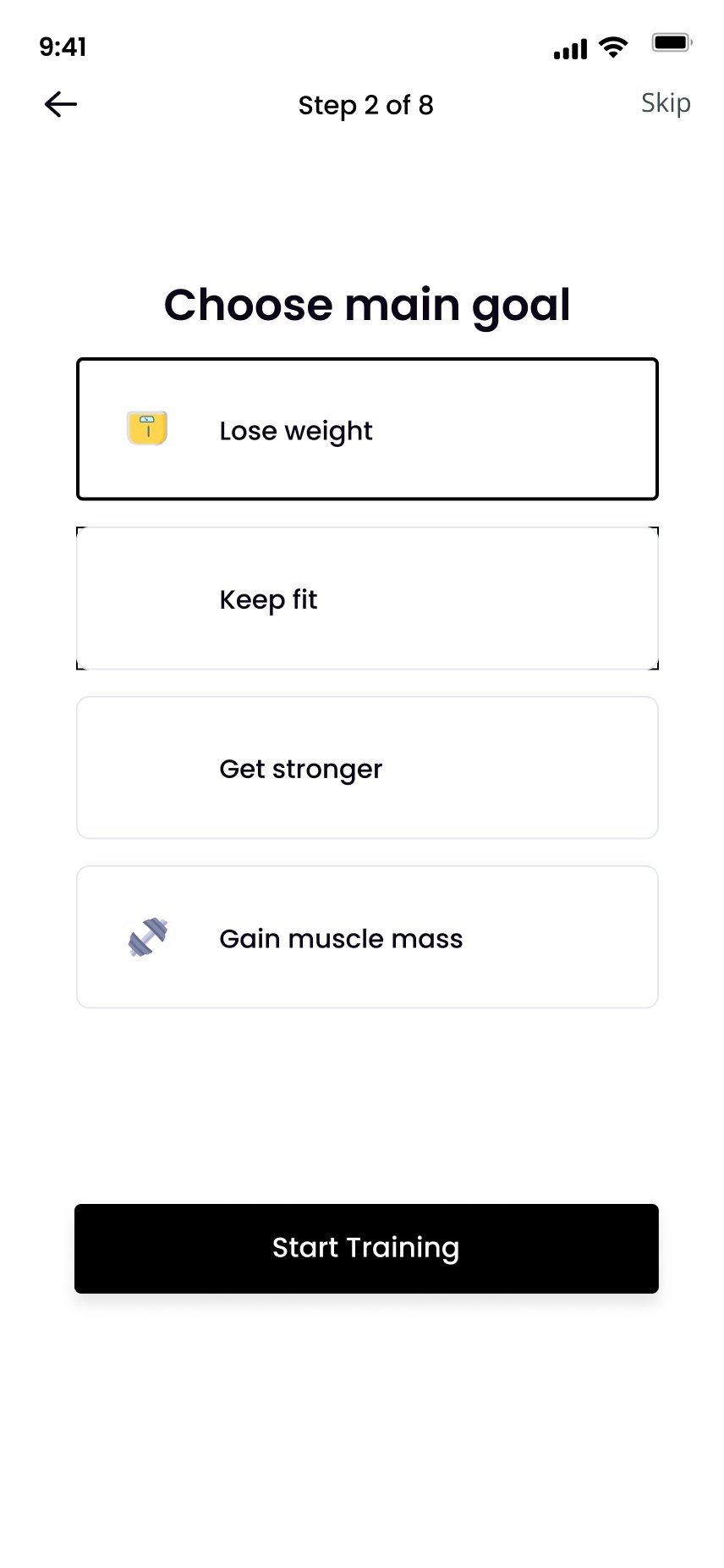
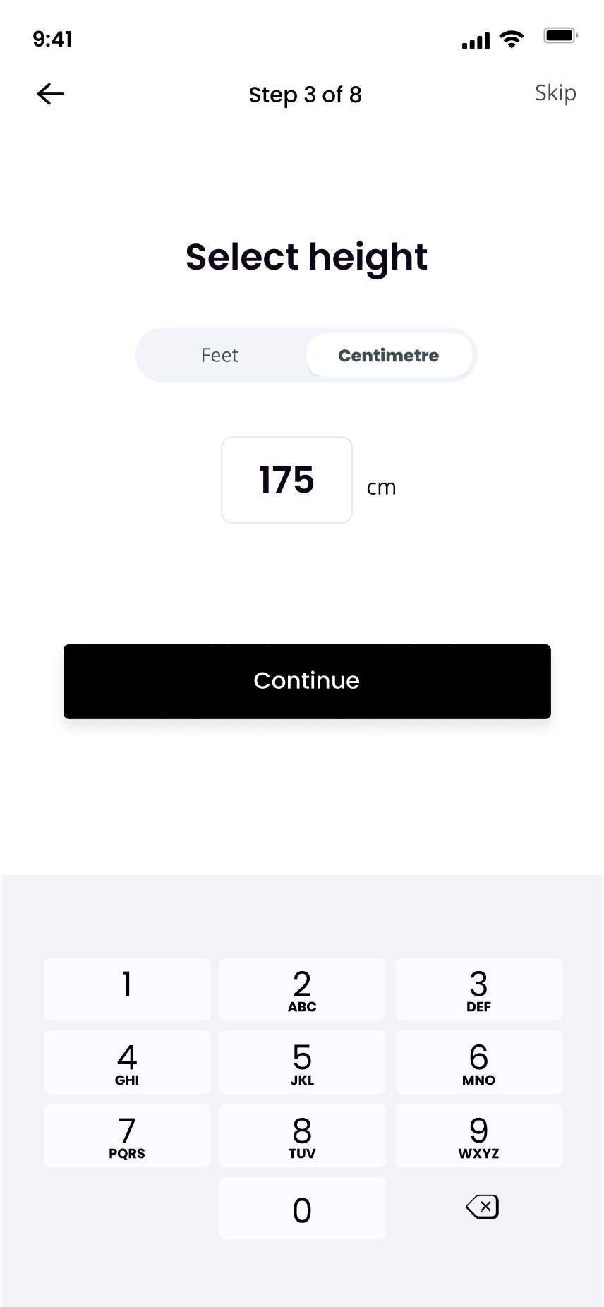
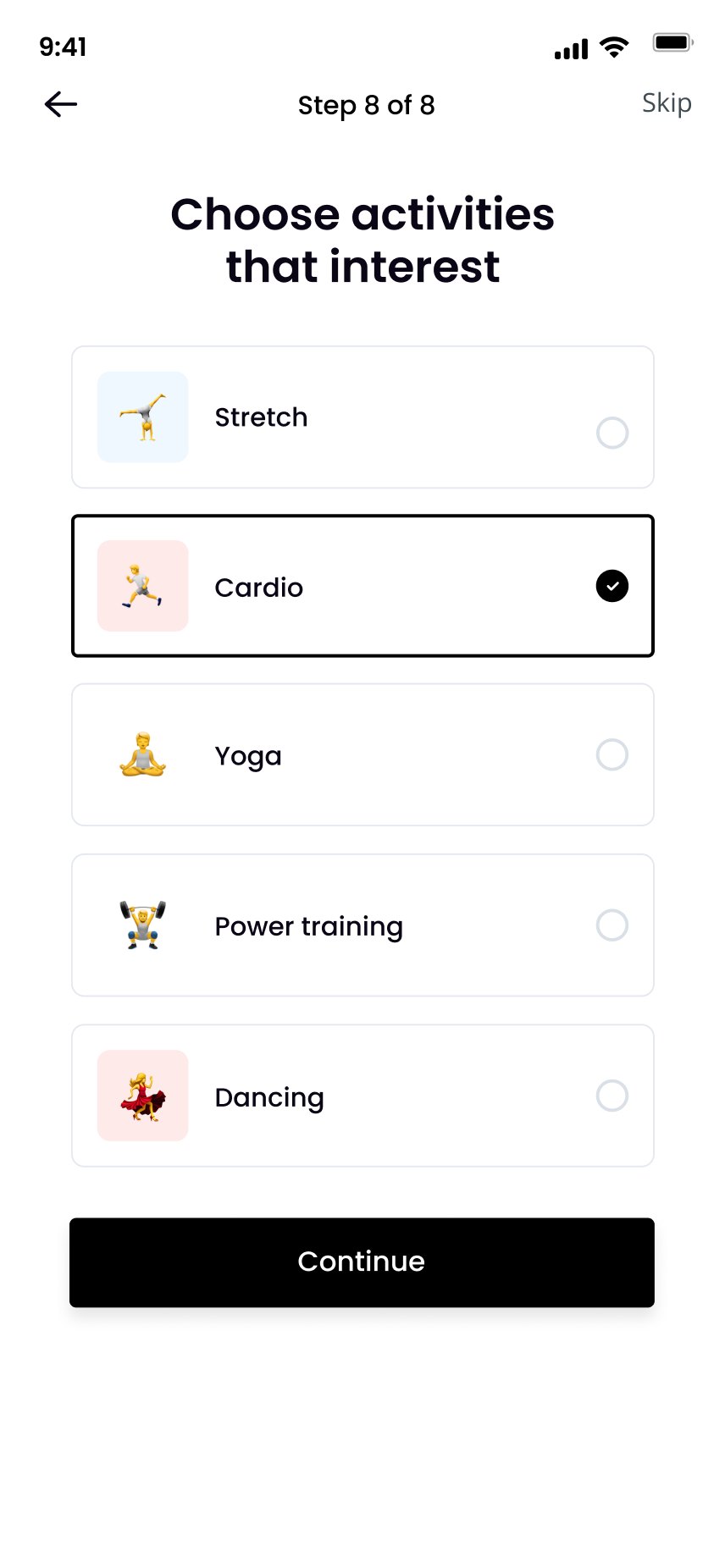
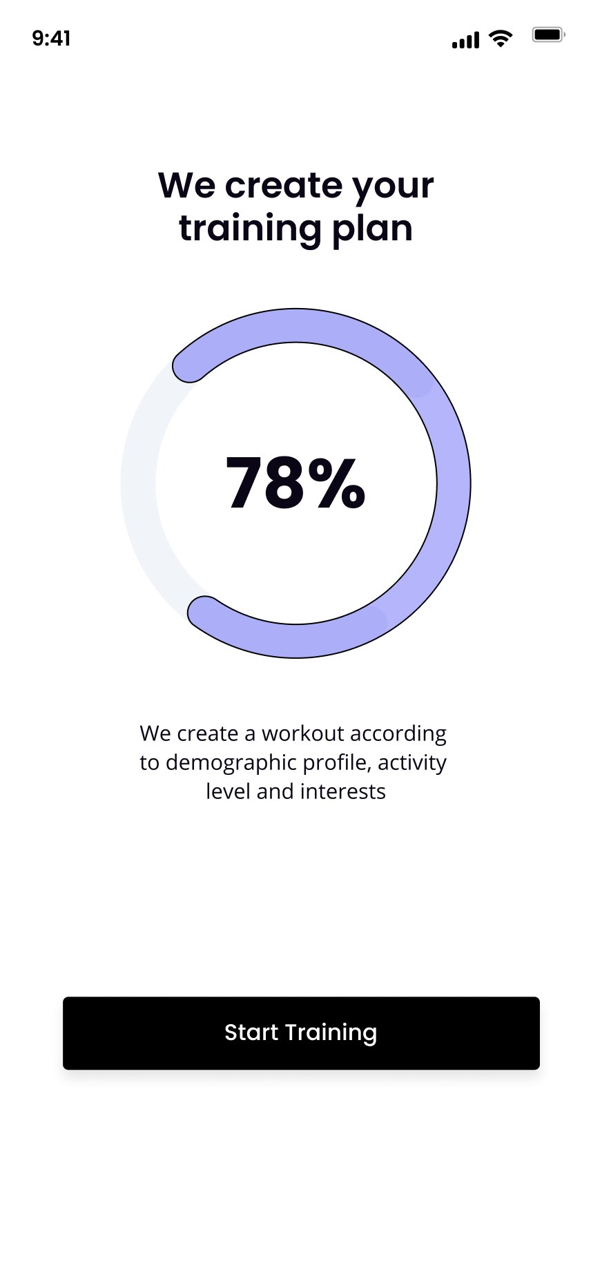
Each step asks one thing on one screen, shows "Step x of 8" and offers Skip. The flow ends on a progress screen that turns answers into a training plan.
How the interactions were worked out
- Type, don't dragHeight and weight use a number field and keypad instead of a scroll ruler. It's faster, more precise and needs no dragging (WCAG 2.5.7).
- One screen, two jobsThe same height and weight screens come back from Profile with "Save" instead of "Continue". One component, two contexts.
- Units are a choiceA Feet and Centimetre toggle sits above the field, so nobody converts in their head.
- Always a way outEvery step has Back and Skip, so the plan never blocks people who don't want to share a number.
One home, four states
Home is designed in four versions: no plan, dietitian only, coach only, and both. Only the My Plan block changes. Everything people learn about the rest of the screen stays true. Scroll inside each phone to see the full screen.

| State | My Plan block |
|---|---|
| No plan | Two discounted consultations and View All Plans |
| Dietitian | Book your dietitian, plus 10% off a coach consultation and View All Plans |
| Fitness coach | Book your trainer, plus 10% off a dietitian consultation and View All Plans |
| Both | Refer a friend, and book either expert |
One template, five metrics
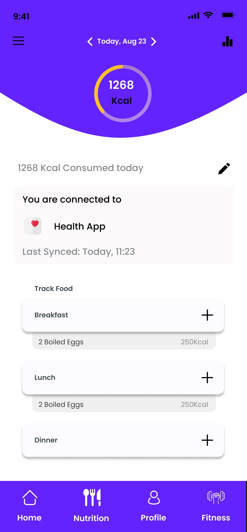
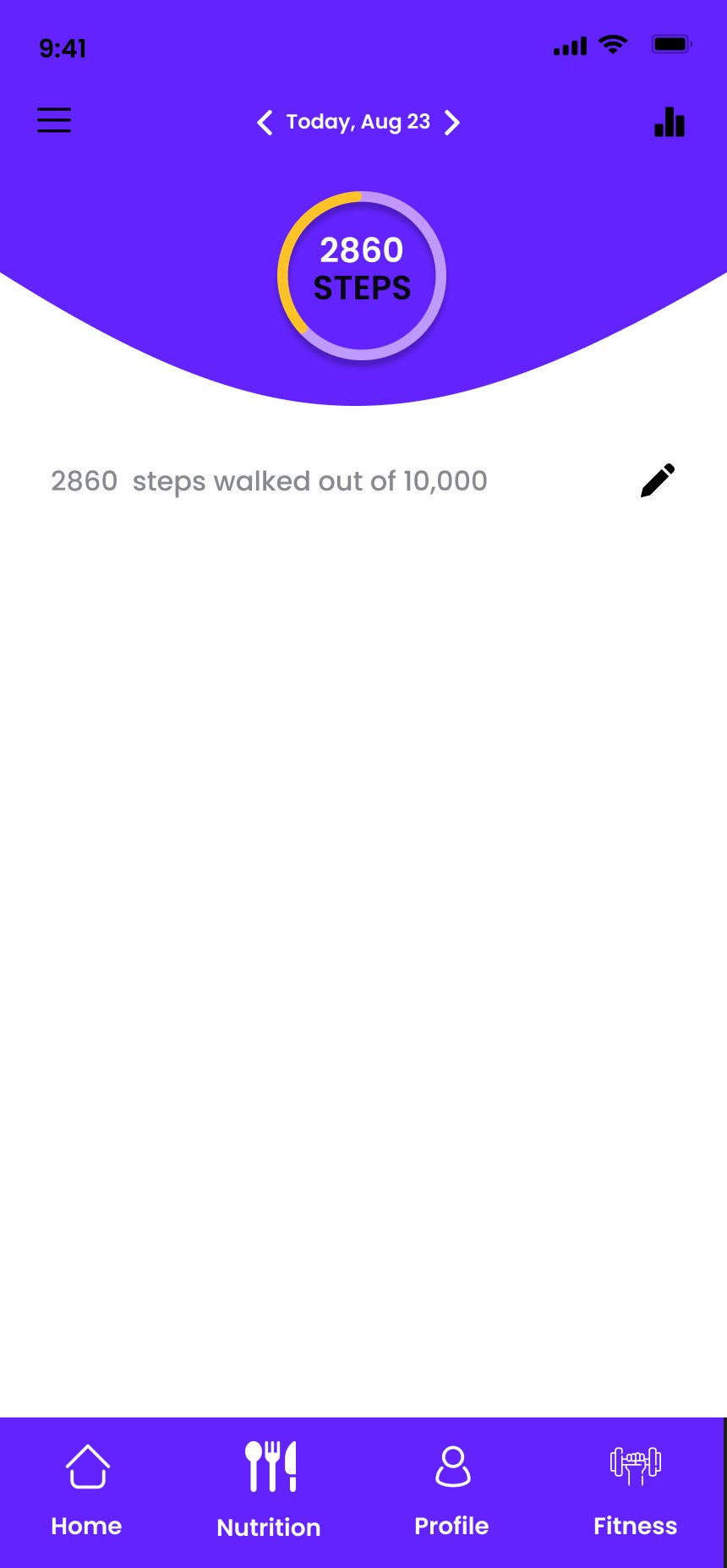
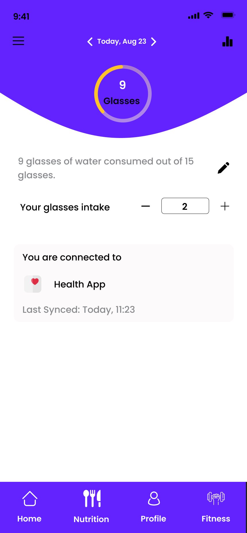
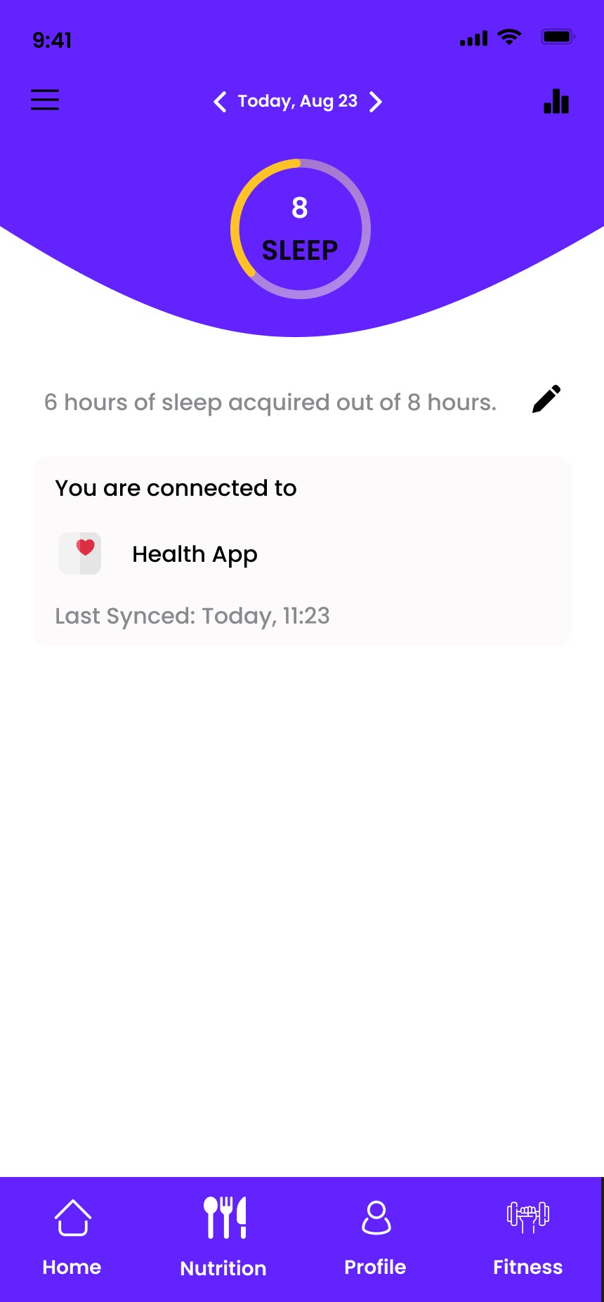
Steps, water, sleep, calories eaten and calories burnt share one layout. Learning one tracker teaches all of them.
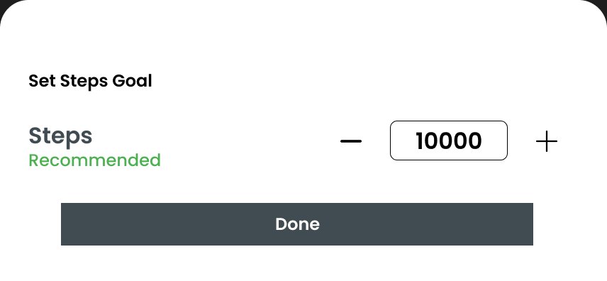
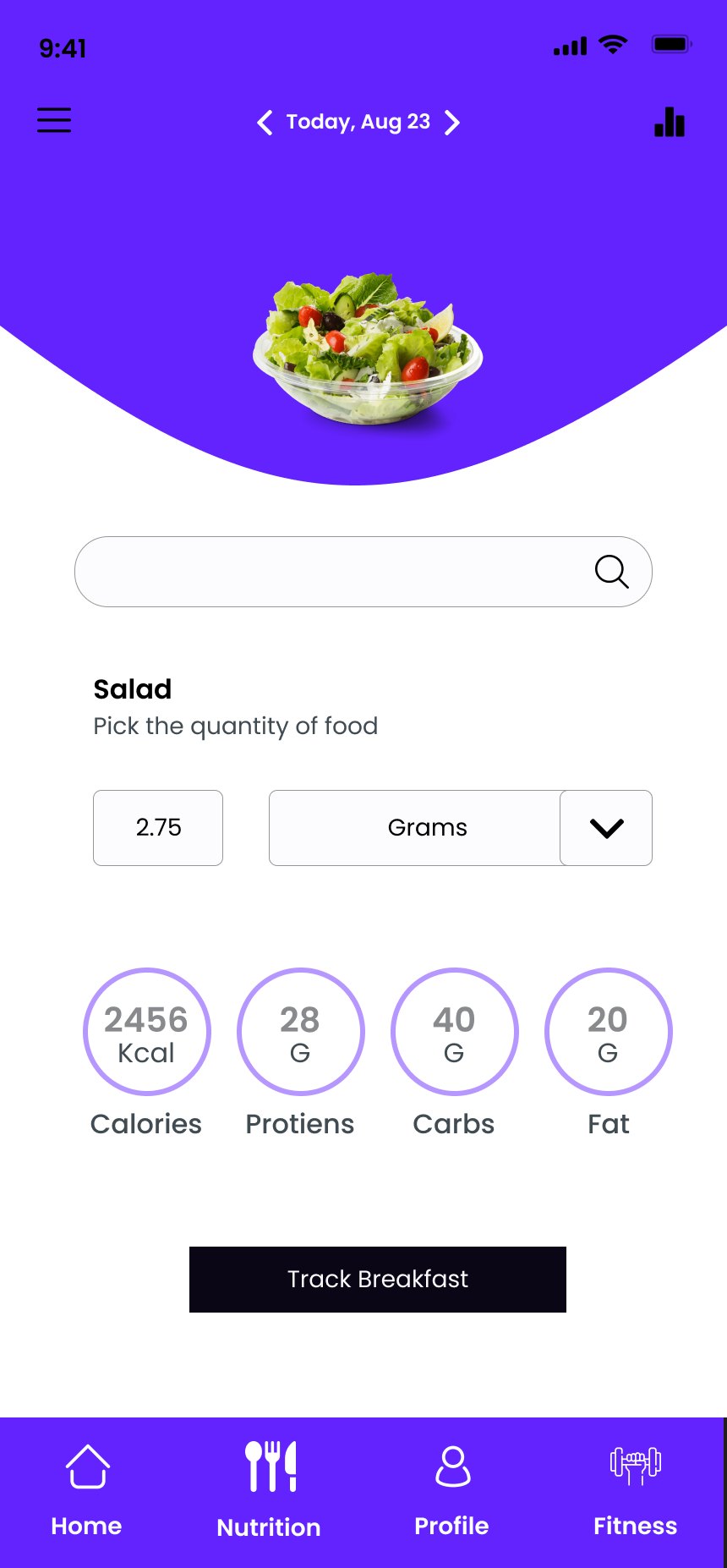
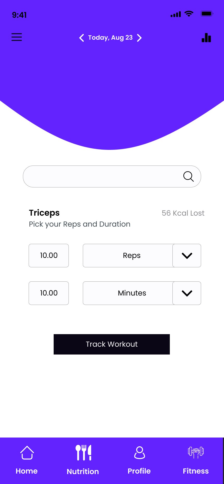
Anatomy of a tracker
- Date stepper. "Today, Aug 23" with previous and next arrows.
- Progress ring. Value and unit inside, for example 2860 steps.
- Sentence summary. "2860 steps walked out of 10,000" says what the ring shows, in words.
- Edit goal. A pencil opens a bottom sheet with a stepper and a recommended value.
- Sync status. "You are connected to Health App · Last synced Today, 11:23".
- Log list. Meals or workouts to add to, where the metric is logged by hand.
Why one template
Five metrics with five layouts would mean five things to learn. One layout lets the metric change while position, gestures and wording stay the same. The sentence summary also makes each ring readable without seeing it, which matters for screen-reader users.
From a plan to a person
The paid side of the app is people. Members pick a coach or dietitian, book a slot, then chat or call. Plans arrive as today's meals and workouts, each with Skip, Change and Done.
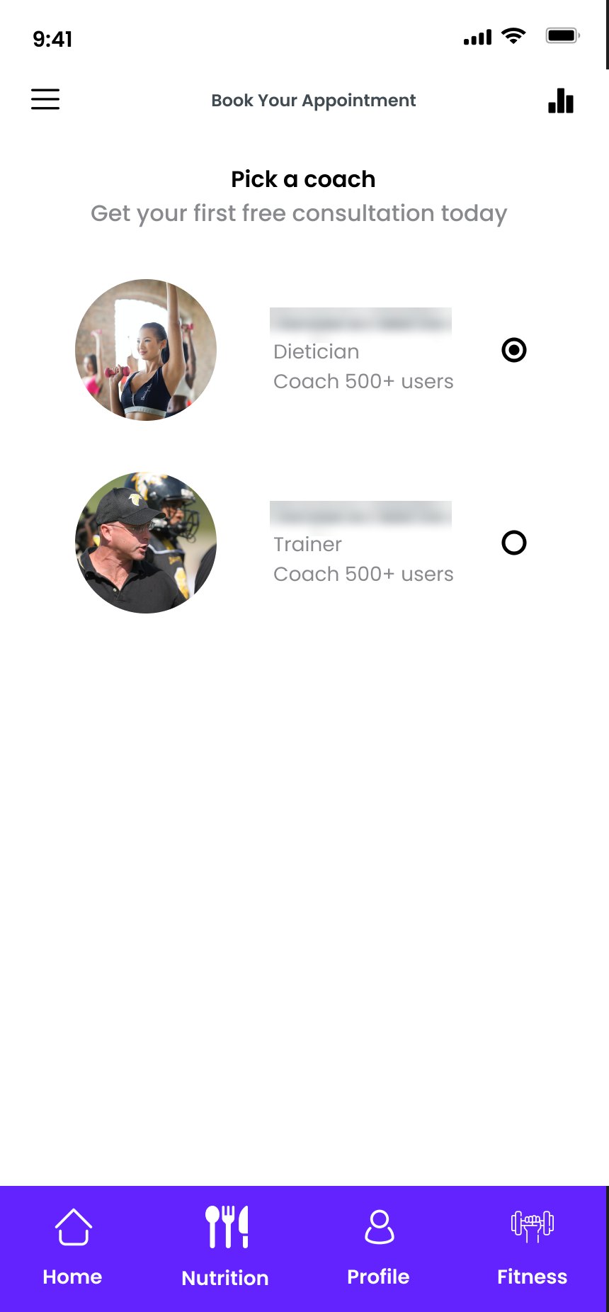
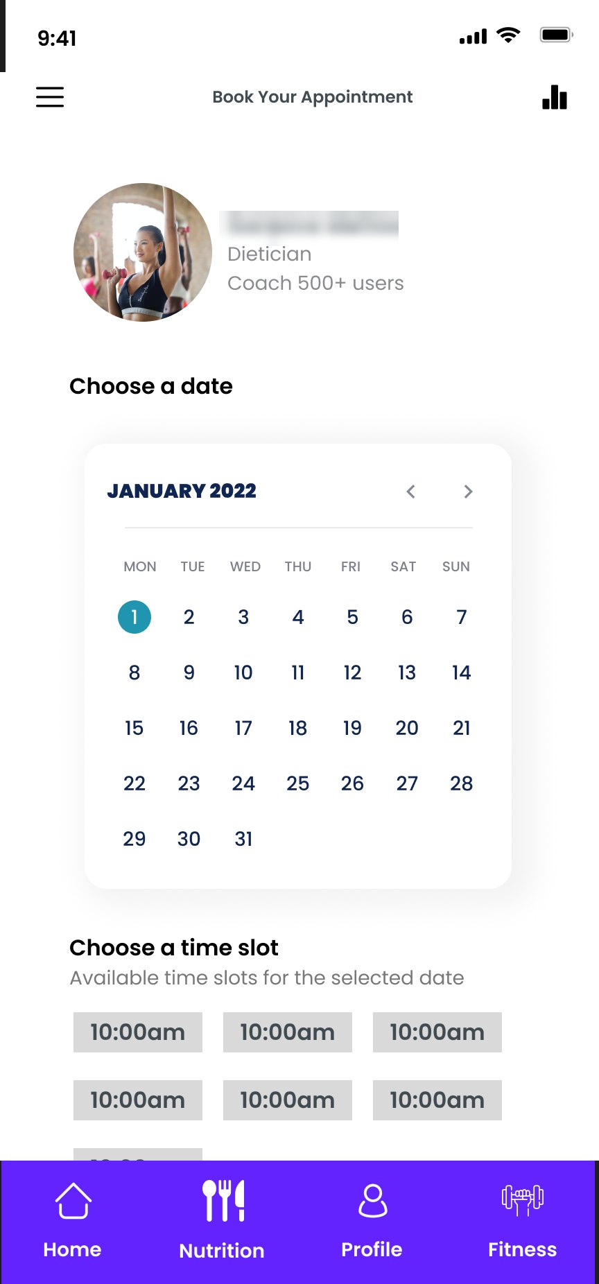
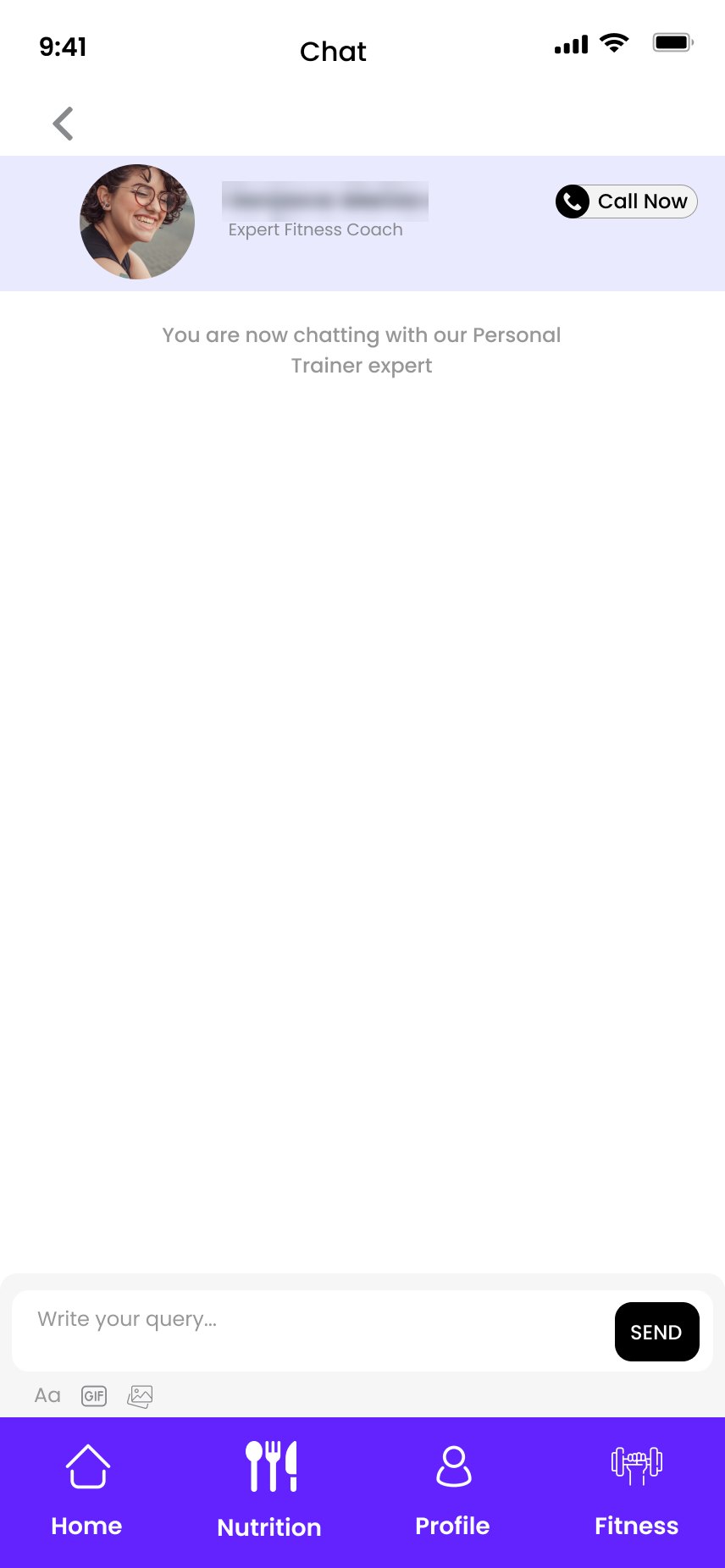
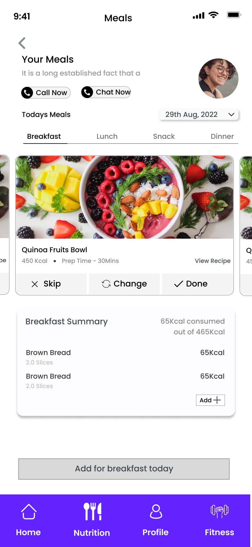
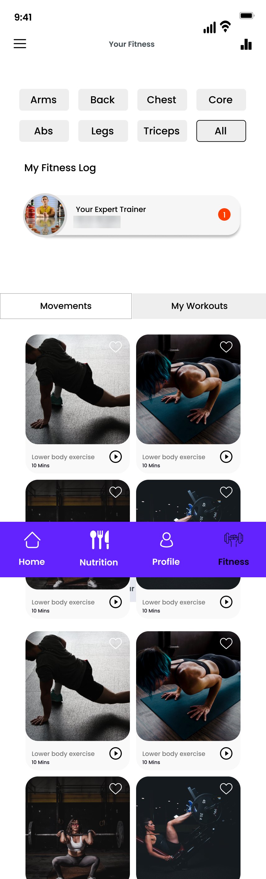
Expert and member names in these screens are blurred.
Four kinds of movement
The prototype uses four interaction types, and each maps to a native pattern on both platforms. Counts come from the Figma prototype.
- 131Interactions in total
- 6Open a bottom sheet as an overlay: goals and reminders
- 31Swap a component state in place: calendar days
- 1Timed: splash to welcome
- Splash
- Welcome
- Sign in
- Sign up
- Verify
- 8 setup steps
- Plan ready
- Home
- Trackers · Nutrition · Fitness
| In the prototype | Used for | iOS | Android |
|---|---|---|---|
| Navigate | Moving deeper: Home to a tracker, a step to the next step | Push in a navigation stack, with a back chevron and edge swipe | New destination. System back gesture or button returns. |
| Overlay | Set a goal, pick a reminder day and time | Sheet with a grabber, dismissed by swipe or Done | Modal bottom sheet, dismissed by back, scrim tap or Done |
| Change to | Selecting a day in the calendar | Selected state, announced as "selected" | Selected state, announced as "selected" |
| After delay | Splash to welcome | Launch screen, then the first view | Splash screen API, then the first view |
The parts that repeat
The screens are built from a shared library: calendar days, week and month views, text fields, primary buttons, checkboxes and icons. The day chip alone is used 35 times. These are recreated specimens with their states; the bottom bar shows the original next to a suggested fix.
Day
Days · Variant = Today | On | Off35 instances across trackers and booking. Each state differs in fill and border, not just colour hue.
Text field
Text Field / Ordinary · Inactive | FocusedIn the original, the label sits inside the field and disappears on typing. The specimen keeps a visible label above it (WCAG 3.3.2).
Unit toggle and stepper
Segmented · StepperThe two controls behind every number in the app. The steppers use 44pt targets and announce the new value.
2860 steps walked out of 10,000
Progress ring
Tracker headerAlways paired with the sentence summary, so the ring's meaning never depends on seeing it.
Bottom bar
Tab bar · 4 destinationsAs designed, the active tab is shown only by a black label on purple, which is 3.2:1 and below the 4.5:1 needed for text this small. The fix adds a shape change and bolder text, and exposes the state to screen readers.
A token library, and the gap to close
The Figma file holds a token library: 84 variables in four collections, plus 14 text styles in Poppins. The table shows real names and values from the file.
| Collection | Variables | Examples |
|---|---|---|
| Color Primitives | 35 | brand/lime #99FF35 · brand/teal #1CE1CF · purple/violet-deep #6323FE · neutral/gray-600 #5C5C5C |
| Color Semantic | 18 | bg/default → white · text/default → black · action/primary → lime · text/muted → gray-400 |
| Typography | 21 | font/family/primary Poppins · sizes 11 to 96 · line heights 110, 125, 150% |
| Spacing and Radius | 10 | spacing/xs 4 to spacing/2xl 32 · radius/sm 4 to radius/full 999 |
What the audit of the tokens found
Screens aren't bound yet
No layer on the Studio mobile page is bound to a variable. Colours like the Studio purple are typed in as raw values in hundreds of places.
Two brands in one semantic layer
action/primary points to lime, the wider Urbanfit brand. Studio's purple exists only as a primitive (purple/violet-deep), so the app's main colour has no semantic name.
A muted token that fails
text/muted resolves to #8D8D8D, which is 3.32:1 on white. It fails for body text.
| Semantic token | Default mode (today) | Studio mode (proposed) | Check on white |
|---|---|---|---|
action/primary | brand/lime | purple/violet-deep | White label on it 6.56:1 |
text/on-primary | brand/green-deep | neutral/white | 6.56:1on violet-deep |
text/muted | gray-400 · 3.32:1 | gray-600 | 6.69:1 |
text/secondary | gray-500 | No change | 4.67:1, just passes |
Adding a mode keeps one library for every Urbanfit product while letting the app keep its own colour. Binding the screens to these tokens is the step that makes the fixes apply everywhere at once.
One design, two platforms
The Figma file holds one set of iPhone-sized frames (428 × 926). The table shows how that shared design maps to each platform's conventions.
| Element | In the design | iOS | Android |
|---|---|---|---|
| Bottom bar | 4 tabs with icon and label | Tab bar | Navigation bar (3 to 5 destinations) |
| Back | Top-left back arrow | Back chevron plus edge swipe | System back must work too, not only the arrow |
| Health data | "You are connected to Health App" | Apple Health (HealthKit) | Health Connect. Google Fit's APIs are deprecated in 2026. |
| Social sign-in | Apple, Facebook, Google | Sign in with Apple shown first | Google sign-in shown first |
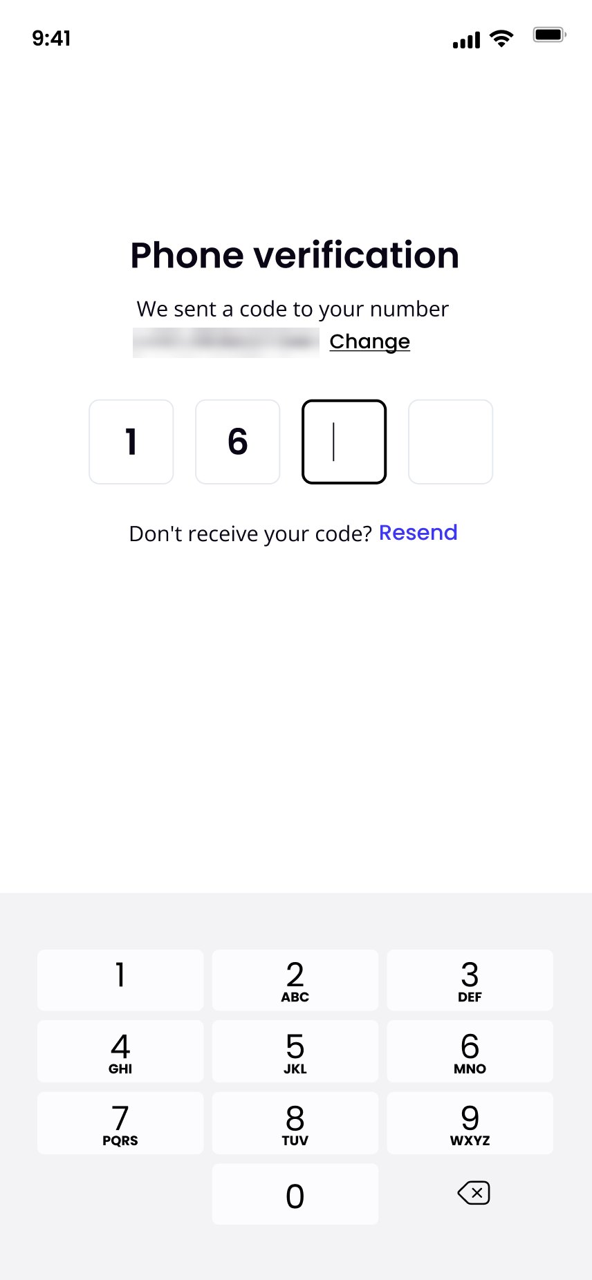
| One-time code | 4 boxes and a numeric keypad | Code autofill from Messages | SMS code autofill |
| Numbers | Typed on a keypad, with units | Number pad keyboard | Numeric keyboard |
| Goal sheets | Overlay from the bottom | Sheet | Modal bottom sheet |
| Touch targets | Mixed sizes | At least 44 × 44 pt | At least 48 × 48 dp |
| Text size | Fixed sizes, from 8pt up | Dynamic Type | Font scale (sp units) |
The generic "Health App" label is a quiet strength: one string works on both platforms, and only the connection behind it changes.
Checked against WCAG 2.2 AA
The audit applies WCAG 2.2 AA to the native app, using W3C's draft guidance for mobile apps. Counts come from the text layers inside the 75 screen frames.
- 454Of 1,832 text layers are smaller than 12pt
- 380Text layers in greys below 4.5:1 on white
- 1.15:1Lowest contrast: white values on the pastel Home tiles
- 0Drag-only inputs. Every number can be typed or stepped.
| Finding | WCAG 2.2 | Severity | Fix |
|---|---|---|---|
| White 10pt values on the pastel Home tiles (Walk, Workouts, Sleep, Water, Calories) | 1.4.3 Contrast | High | 1.15 to 1.76:1, and the grey tile labels fail too. Use dark text (#0A0615) at 12pt or more. |
| Grey body text: #898A8D (220 layers), #979797 (79), #787878 (81) | 1.4.3 Contrast | High | 3.45, 2.92 and 4.42:1. Bind to a passing token such as gray-600 (6.69:1). |
| Fixed text sizes, many under 12pt and some at 8pt | 1.4.4 Resize text | High | Map text styles to Dynamic Type and sp. Set 12pt as the floor, and test at the largest setting. |
| Active tab shown only by a black label on purple | 1.4.1 · 1.4.3 · 4.1.2 | Medium | 3.2:1. Add a shape indicator and expose the selected state. |
| Activity graph uses red and green bars to mean low and on-target | 1.4.1 Use of colour | Medium | Add a goal line and value labels. Green text #4CAF50 is also 2.78:1. |
| Labels inside text fields disappear on typing | 3.3.2 Labels or instructions | Medium | Keep a visible label above each field. |
| Icon-only buttons: social sign-in, edit pencil, play, favourite | 4.1.2 Name, role, value | Medium | Give each an accessible name, for example "Edit steps goal". |
| Emoji as option icons in setup steps | 1.1.1 Non-text content | Low | Hide them from screen readers, so "Woman" isn't read twice. |
| One-time code entry | 3.3.8 Accessible authentication | Low | Allow paste and platform code autofill into the four boxes. |
| Placeholder copy in workout and blog descriptions | Content quality, not WCAG | Low | Replace before release. A screen reader reads placeholder text out loud. |
What already works
- No dragging requiredHeight, weight and goals are typed or stepped, never dragged (2.5.7).
- Words next to ringsEach tracker says its value in a sentence, not only in a graphic (1.1.1).
- Labelled navigationEvery tab has a text label, not just an icon.
- Inclusive choicesA gender-neutral option, a unit toggle, and Skip on every setup step.
What I'd tell the next team
Patterns beat screens
Seventy-five frames came down to a handful of patterns: the tracker template, the goal sheet, the state-driven Home. The patterns are the real deliverable.
State is design work
Designing four Home states up front made the upsell honest. People only see offers for what they don't have yet.
Tokens only help when bound
A good token library sat beside screens that didn't use it. Binding them is what turns an audit finding into a one-line fix.
To validate next
- Usability-test plan setup and food logging with 5 to 8 people per platform, including VoiceOver and TalkBack users. Report results as counts.
- Measure setup completion (people who finish step 8, out of those who start step 1) and time to first logged meal.
- Compare plan uptake between the in-context offer and the plans list, using a control group before calling either one better.
Screens are exported from the Urbanfit Studio Figma file. Member and expert names, and phone numbers, are blurred. Specimens in section 08 are recreations. Platform guidance: W3C Guidance on Applying WCAG 2.2 to Mobile Applications (Group Draft Note, May 2025); Android Developers, Google Fit migration FAQ.