On this page
- Micro case study
- Mobile commerce · iOS and Android
- Fashion
- Accessibility
Poshmera: a fashion app built for trust at checkout
A new women's fashion app from Urbanfit, designed from research to launch. The work centred on the moments Indian shoppers hesitate: size, delivery, price and payment.

Research first, then launch
I led UX from research to launch. Research and results below are as reported in my portfolio; the design file shows the screens and flows.
- 15Target shoppers interviewed
- 250Survey responses
- 3Rounds of usability testing
- 8,000Installs in the first month, against a target of 5,000
- 4.3★App Store rating
- 13%Checkout completion
The 13% needs its denominator stated (sessions that reached the bag, or all sessions) before it can be compared with anything.
Browse freely, sign in only to pay
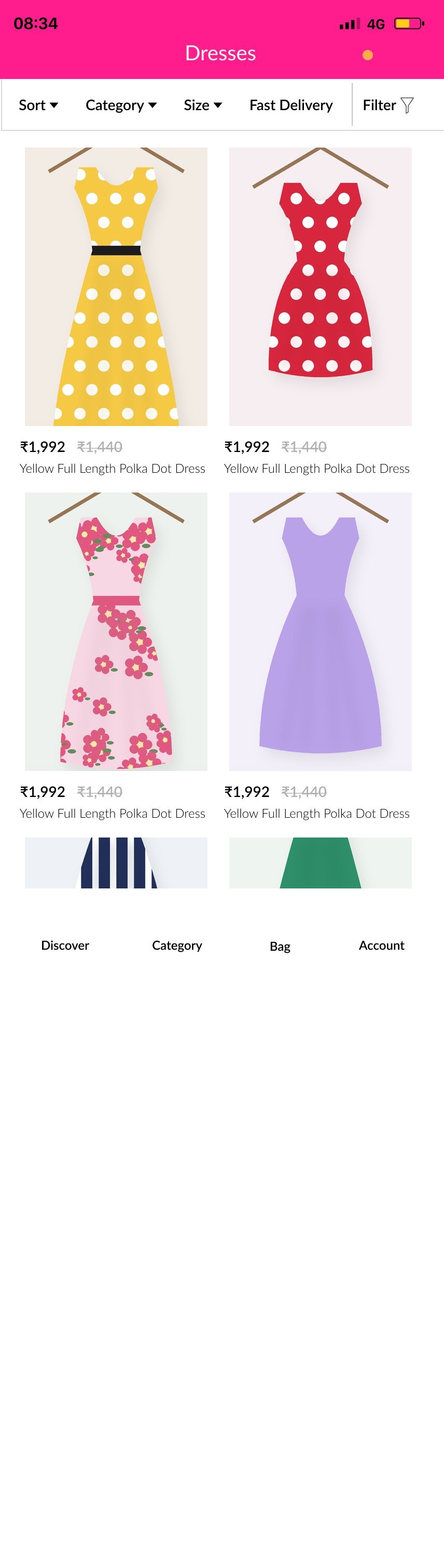
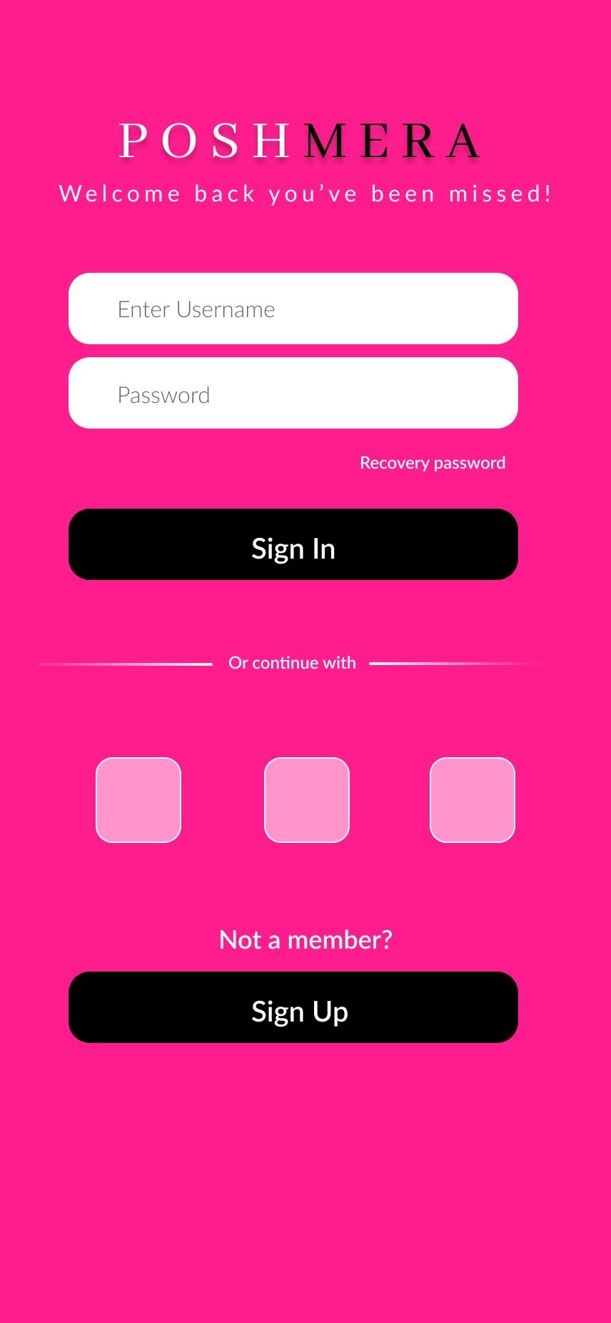
Shoppers browse, filter, save and fill a bag without an account. Sign-in appears only when they continue to checkout, so the account ask comes after the intent to buy.
- Discover
- Category
- Listing + filters
- Product
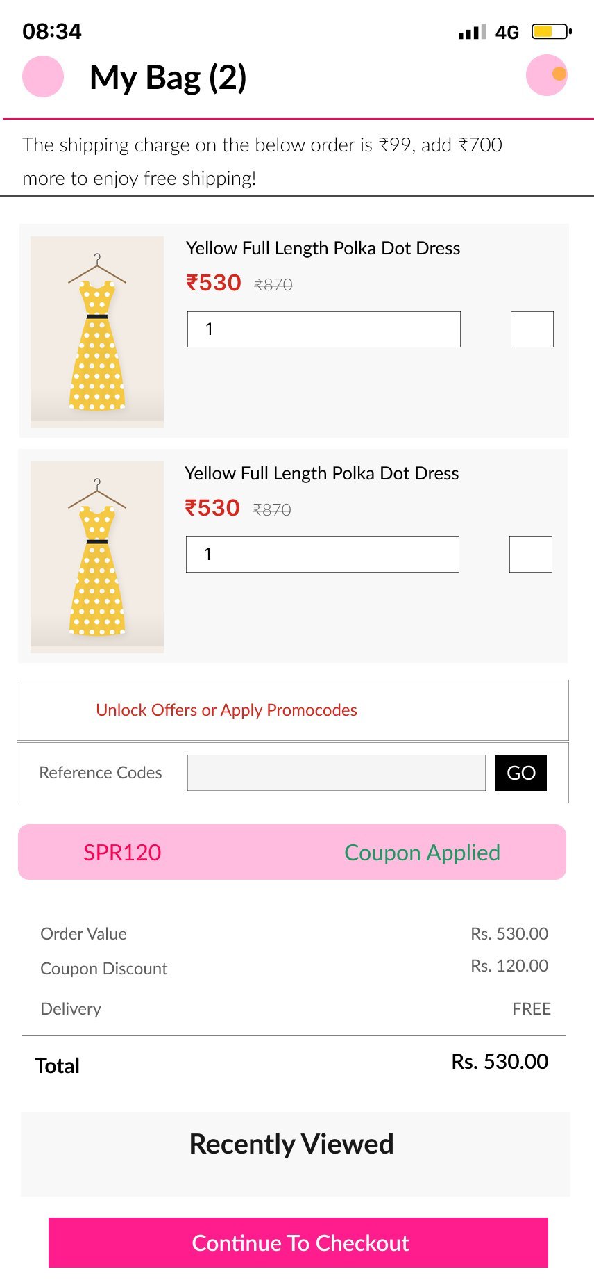
- Bag + coupon
- Sign in or sign up
- Address
- Checkout
- Payment success
- 286Prototype interactions on the mobile page
- 3Starting flows: launch, home and sign-in
- 4Tabs: Discover, Category, Bag, Account
- 7Home layout explorations on the desktop page
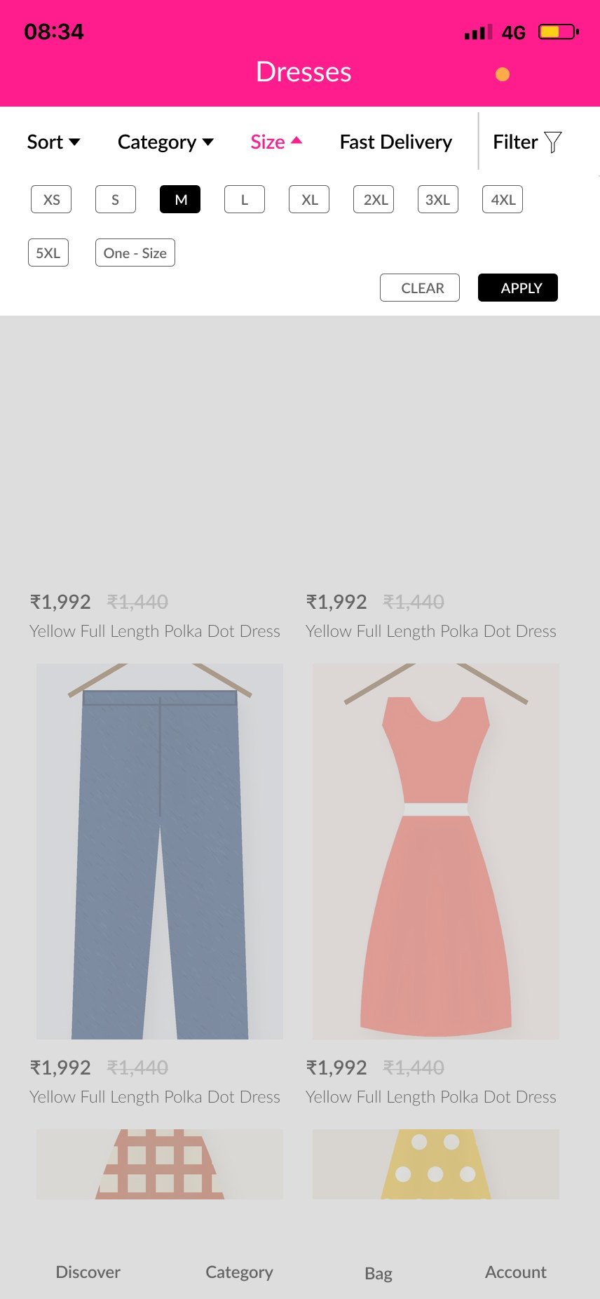
Quick filters on top, full filters one tap away
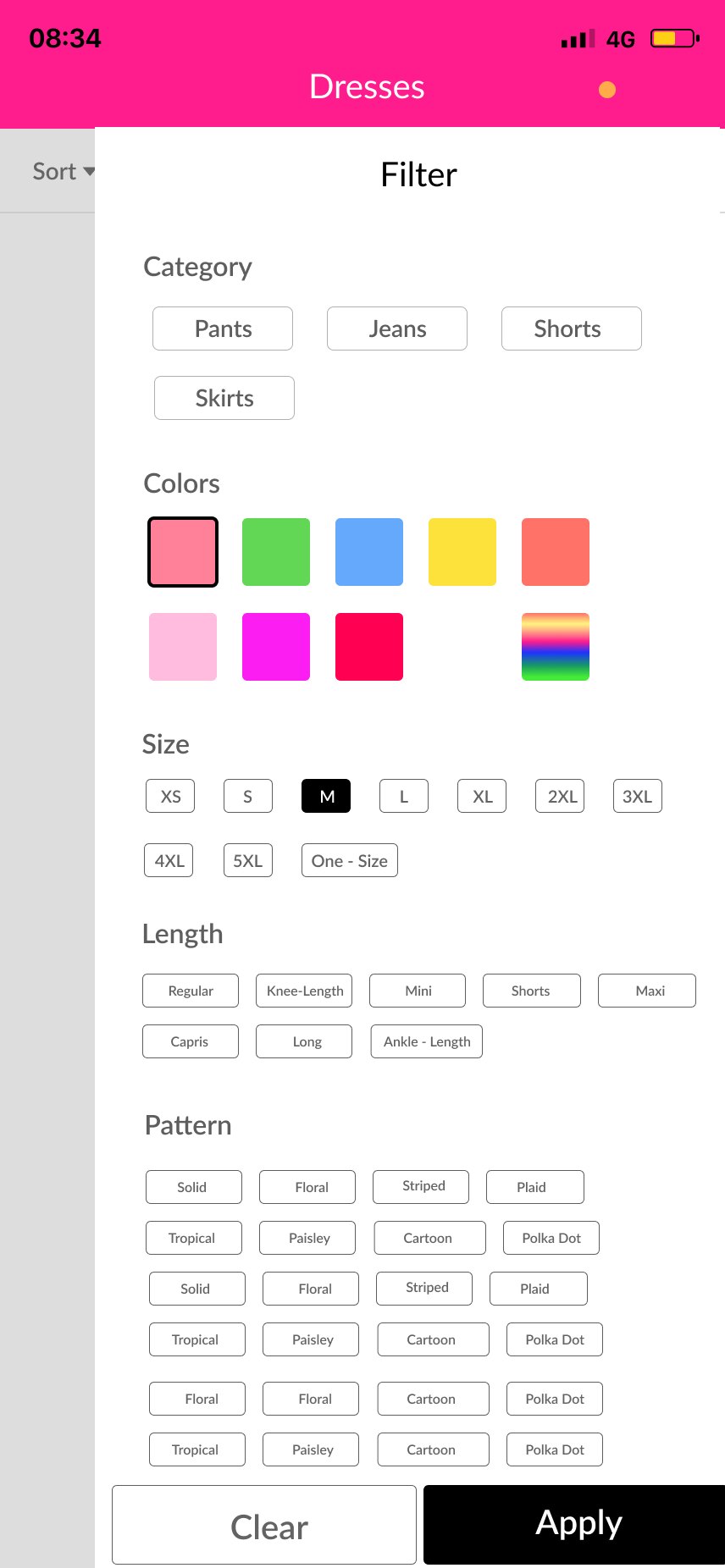
One long filter screen
Complete, but slow for the most common filter, which is size.
Two levels
A sticky bar holds Sort, Category, Size and Fast Delivery as dropdowns. Filter opens the full list for colour, length and pattern.
Answer the doubts before they become exits
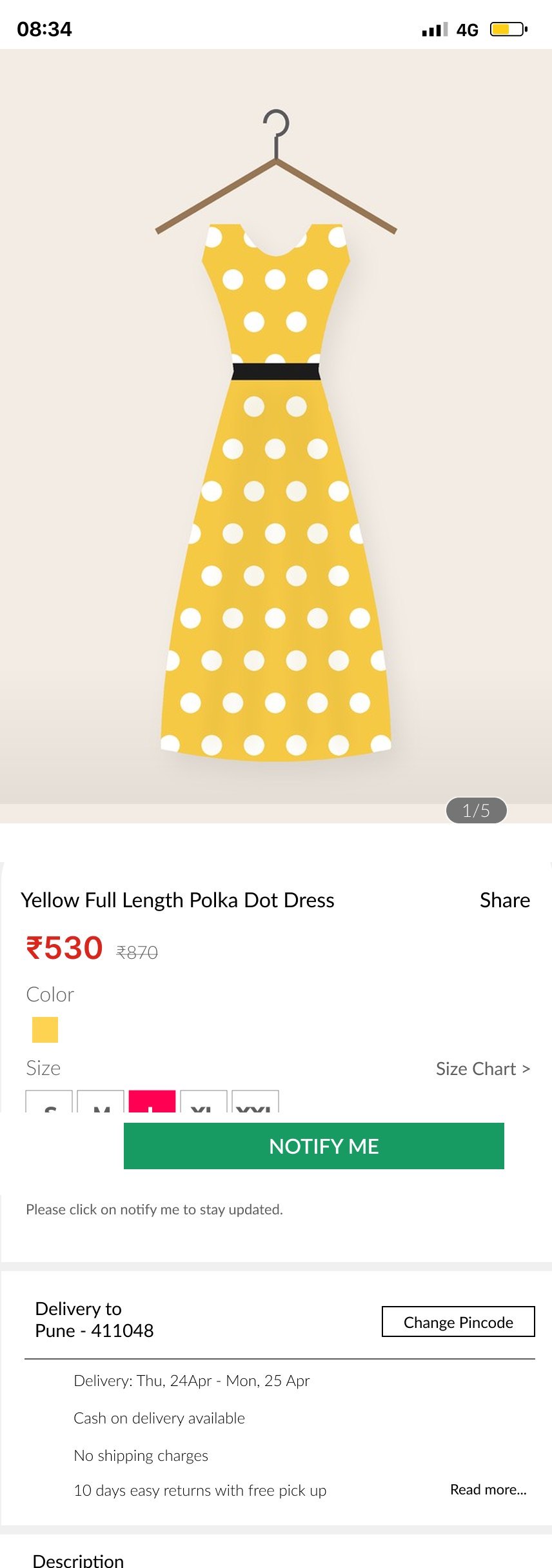
The product page answers the questions that stop a purchase: is my size in stock, when will it arrive, can I pay cash, and can I return it.
Keep the shopper, not the stock
When a size is sold out, the main button changes to Notify Me instead of disappearing. The file explores colour versions of it: orange and green on mobile, yellow and green on desktop.
Delivery promise in the page
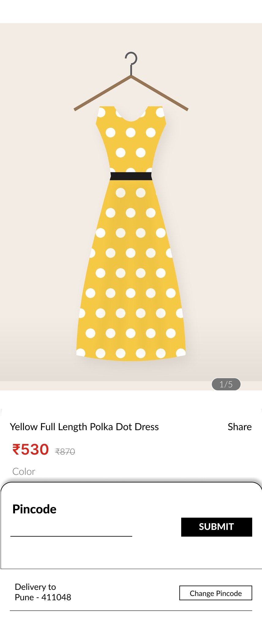
Pincode, delivery dates, cash on delivery, free shipping and 10-day free-pickup returns sit right under the size picker.
Both Notify Me colours fail contrast
White on orange is 1.89:1 and white on green is 3.56:1. A black button keeps the state change and passes.
Make the last steps feel safe
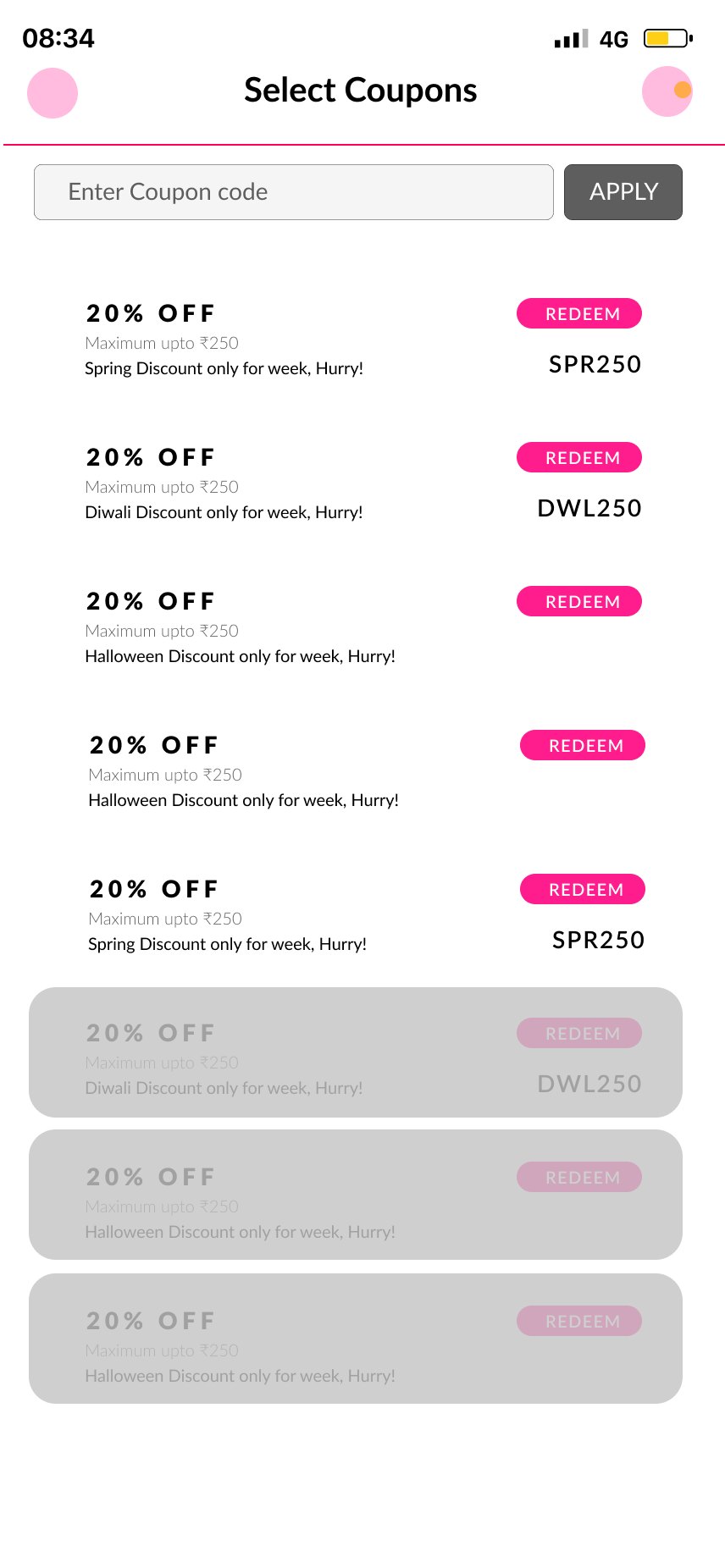
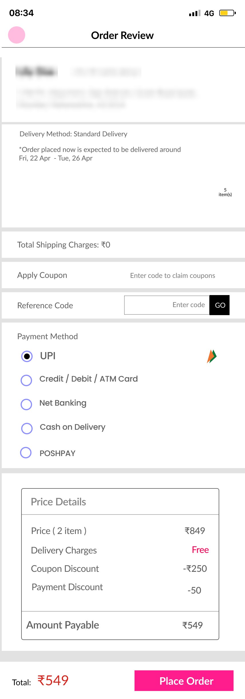
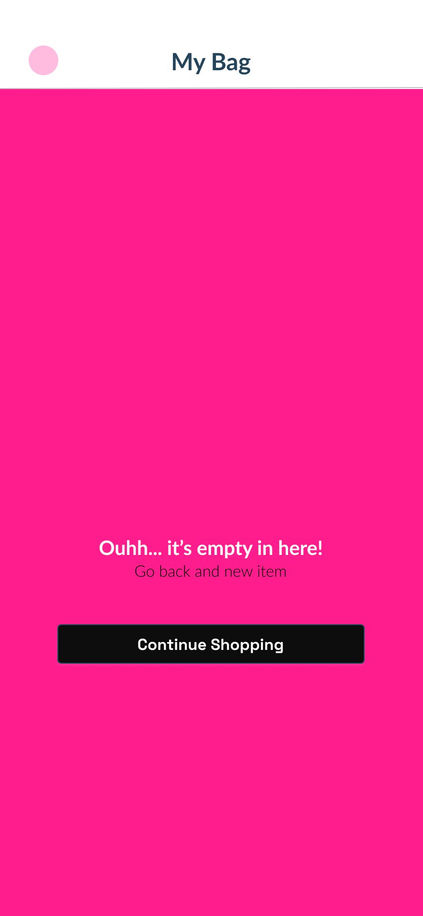
The bag and checkout carry the discount logic, account creation and payment. Each screen gives one clear next step.
Payment in the local order
UPI comes first, then cards, net banking, cash on delivery and the store wallet. Cash on delivery is also promised on the product page, so it's never a surprise.
Address from the pincode
The address form links state and city to the pincode, so shoppers type six digits instead of two fields.
Shoppers who sell
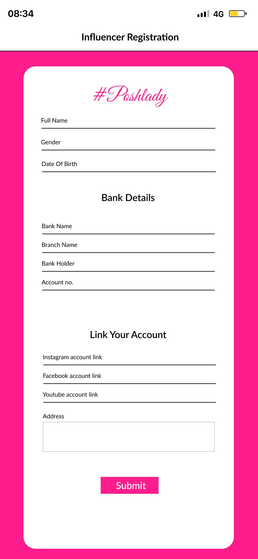
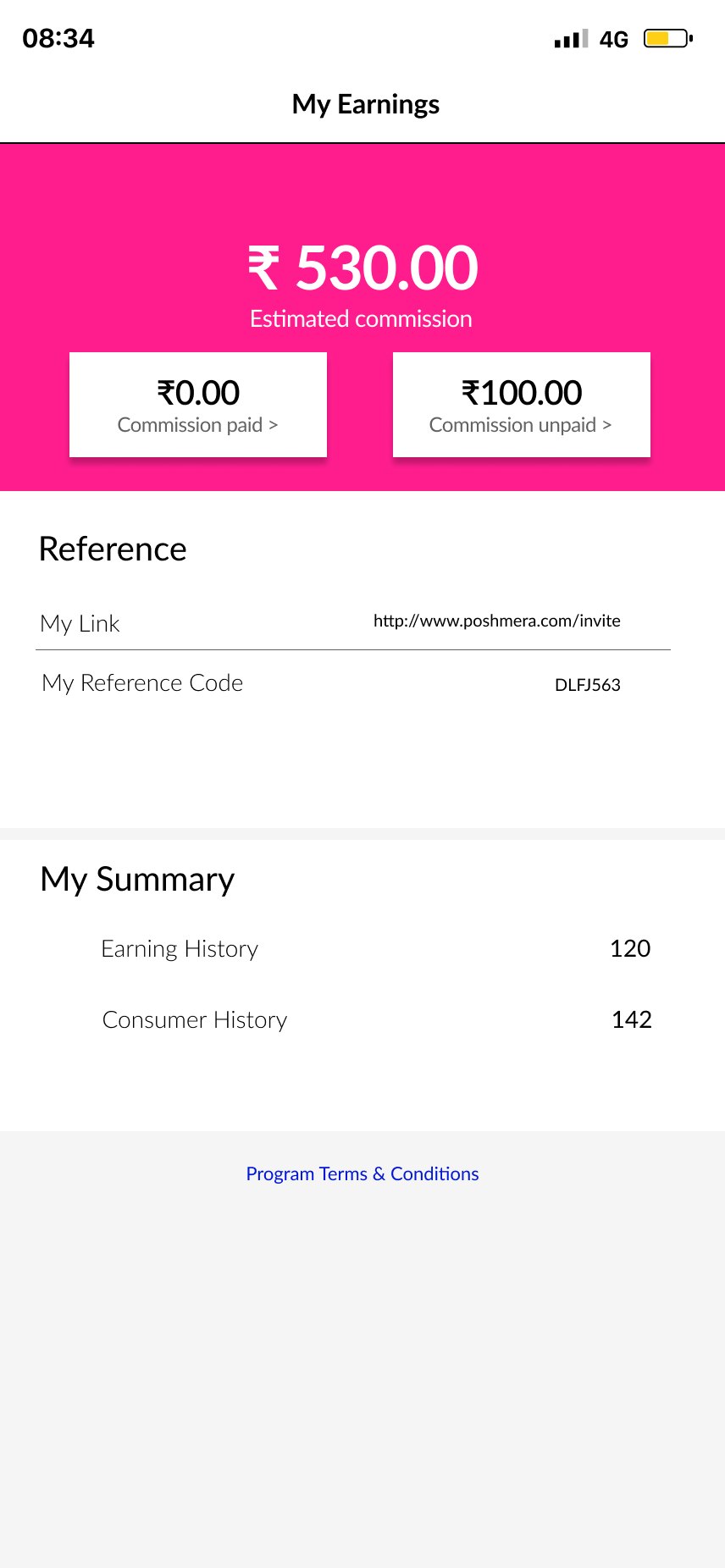
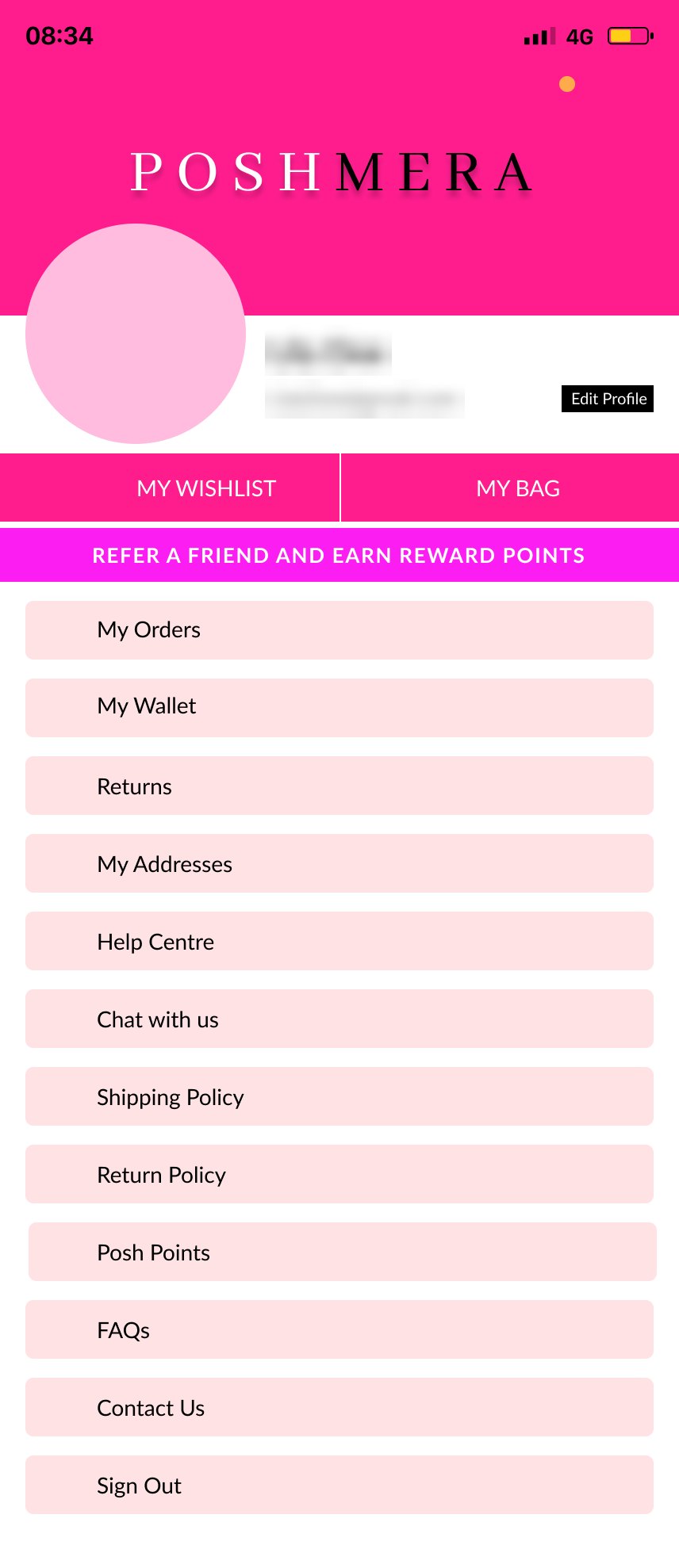
Poshmera also recruited shoppers as influencers. They register, wait for approval, then track commission from their link and code. Referrals and Posh Points reward everyone else.
Two components did most of the work
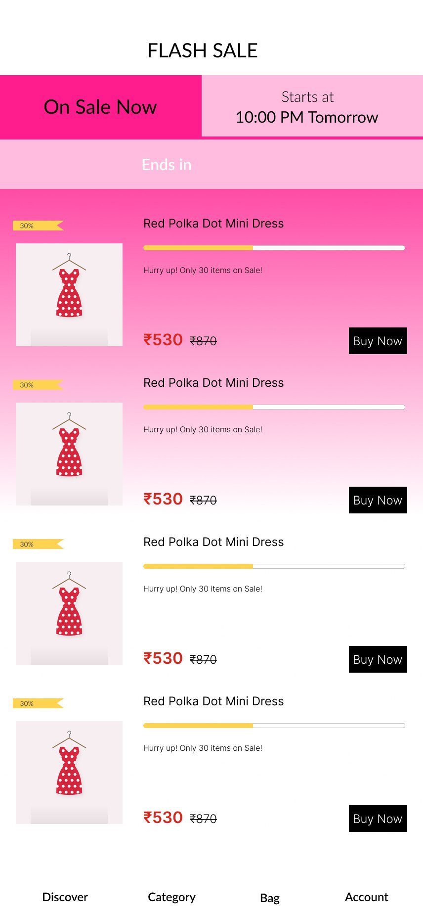
The mobile screens reuse four local components: product price (69 uses), discount badge (41), status bar (32) and bottom bar (10). Colours are typed in directly; no variables are bound. Below: the parts as specimens, with proposed tokens that fix contrast.
Product price
ProdPrices · 69 instancesSale price in a deeper pink that passes on white: 5.22:1, against 3.91:1 as designed. The struck price carries a hidden "was" so screen readers read both prices correctly.
Size chip
Default · Selected · Out of stockOut of stock is shown three ways (dashed border, strike-through, label), not by colour alone. Chips are 44pt.
Notify Me button
Primary action · out-of-stock stateThe two versions in the file are 1.89:1 (orange) and 3.56:1 (green) with white labels. The proposed black button is 21:1, and keeps the state change visible through the label rather than the colour.
| Token | Value | Replaces | Check |
|---|---|---|---|
brand/pink | #FF1D8E | Pink headers and banners (no change) | Black text on it 5.82:1. White text only at 24px+ (3.61:1). |
text/sale | #D6005F | #FF0052 on 275 text layers | 5.22:1 on white |
text/secondary | #5E5E5E | #B0B0B0 and #CCCCCC hint text | 6.48:1, against 2.17 and 1.61:1 |
action/primary | #000000 | Orange and green Notify Me fills | White label 21:1 |
type/family | Lato | Lato plus 7 other families in the file | One family, 12pt minimum |
One design, two stores
The file holds one set of 428 × 926 frames. This is how the shared design maps to each platform.
| Element | In the design | iOS | Android |
|---|---|---|---|
| Bottom bar | Discover, Category, Bag, Account | Tab bar | Navigation bar |
| Back | Back arrow, plus swipe on some screens | Back chevron and edge swipe | System back must also work |
| Pincode sheet | Overlay from the bottom | Sheet | Modal bottom sheet |
| Payment | UPI, cards, net banking, cash on delivery | UPI apps open by link | UPI apps open by intent |
| Phone field | +91 with a flag picker | Phone keypad, SMS code autofill | Phone keypad, SMS code autofill |
| Status bar | Drawn into the frames | System status bar | System status bar |
| Touch targets | Mixed sizes | At least 44 × 44 pt | At least 48 × 48 dp |
Checked against WCAG 2.2 AA
- 402Of 1,545 text layers are smaller than 12pt, down to 7pt
- 275Sale-price layers in a pink that is 3.91:1 on white
- 8Font families on one page
| Finding | WCAG 2.2 | Severity | Fix |
|---|---|---|---|
| Sale prices and pink links at 3.91:1; hint text at 1.61 to 2.17:1 | 1.4.3 Contrast | High | Use text/sale and text/secondary. |
| Notify Me buttons at 1.89 and 3.56:1 | 1.4.3 Contrast | High | Black button, white label. |
| Text down to 7pt, fixed sizes | 1.4.4 Resize text | High | 12pt floor; support Dynamic Type and Android font scale. |
| Colour swatches in Filter have no names | 1.1.1 · 4.1.2 | Medium | Label each swatch ("Coral, not selected"). |
| Some prototype paths use a swipe to go back to Home | 2.5.7 Dragging movements | Medium | Make sure every swipe has a visible button that does the same thing. |
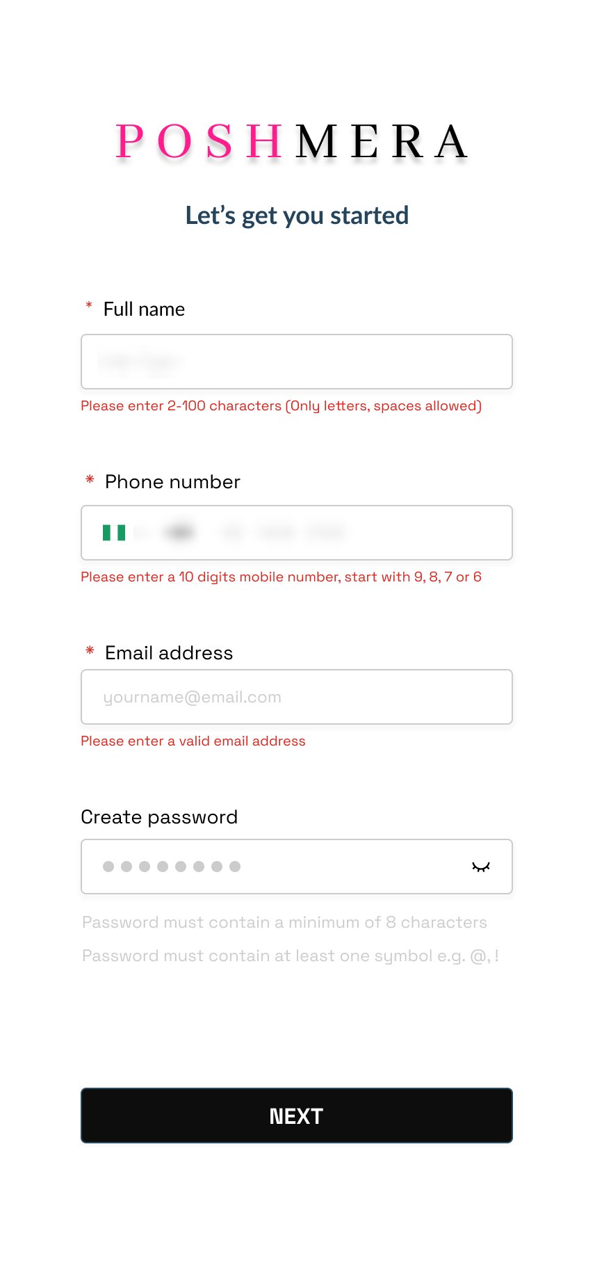
| Phone field shows a Nigerian flag with +91 | 3.3.2 Labels or instructions | Low | Default to India and say it in the label. |
| Policy and FAQ pages hold placeholder text | Content quality, not WCAG | Low | Replace before release; screen readers read it aloud. |
What already works
Errors sit under each field and state the rule. Out-of-stock sizes keep the shopper with Notify Me. Every tab has a text label.
If I ran it again
Name the 13% denominator, bind colours to tokens from day one, and test sign-up and checkout with TalkBack and VoiceOver users in one of the three test rounds.
Screens are exported from the Poshmera Figma file. Product photography is no longer in the file, so product images are illustrated placeholders added for this case study. Names, phone numbers, emails and addresses are blurred. Specimens in section 07 are recreations. Research and results are as reported in my portfolio.